

Logo Story
When the idea of establishing the center was conceived, we needed to select a logo that represents the center’s vision, mission, and students in terms of color and design.
Logo Meaning
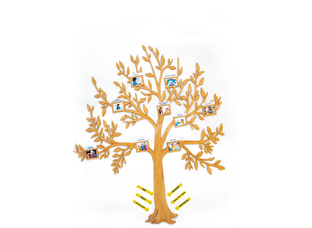
The logo consists of nine branches symbolizing the fundamental areas of human development. It takes the shape of sun rays, signifying how each area starts from emergence and shines towards full potential, aligning with the center’s vision of nurturing the capabilities of people of determination to their highest potential.
We chose “nurturing” instead of “growth” because we need numerous specialized programs for assessment, individual planning, goal achievement, progress tracking, and skill monitoring.
Logo Colors
Blue: Represents positivity, professionalism, confidence, and calmness.
Yellow: Enhances joy and vitality, adds beauty, and increases optimism.
The Sun of Development consists of 9 areas, with each ray representing a specific field:
- Practical Awareness & Performance
- Imitation
- Verbal & Cognitive Performance
- Social Skills
- Gross Motor Skills
- Hand-Eye Coordination
- Self-Care
- Sensory Perception
- Fine Motor Skills